Posted on Nov.06, 2012, under Architecture
(Olympus E-3, 7-14mm (2x crop factor) at 7mm, exposure 1/13th sec @ f/4.5, ISO 250)
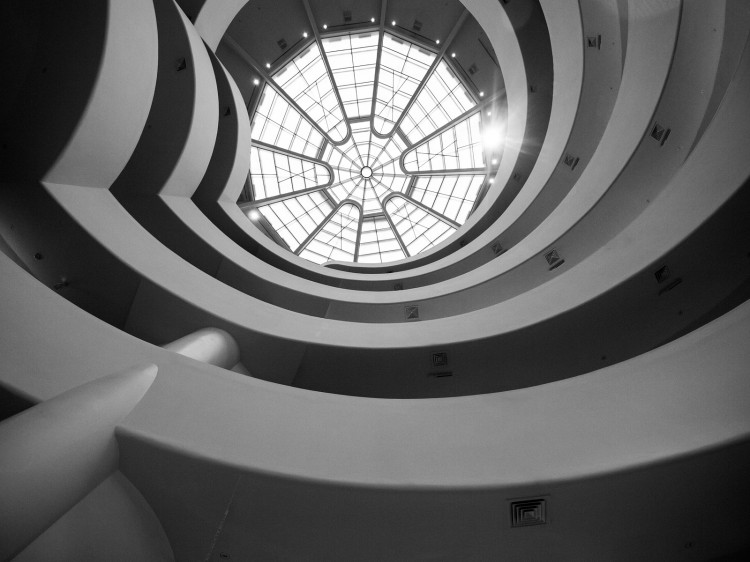
This image shows the interior of the Guggenheim Museum in New York City. Designed by Frank Lloyd Wright and built in 1959, the museum is unique in its use of a spiral ramp to lead patrons through the exhibited items. To view an exhibit you take an elevator to the top and walk down the ramp. It’s an interesting museum and I highly recommend a visit if you are in New York City.
I took this shot in 2009 and it’s been sitting in my Lightroom catalog in various states of editing. I think the design of the space works well with a high contrast black and white, but I was bothered by various ‘blobs’ hanging over the edge of the railings. I wanted to have the edge of the ramp be smooth without distractions of people, coats, etc. breaking up the line. I’ve tried various times to get rid of these extras but I was never able to get a smooth clone. The color/texture/angle just didn’t match up and you could always see the work. I tried again a couple of days ago using a slightly different technique and was pleased with the outcome.
The technique involved using a combination of Content Aware Fill in CS6 and the Clone Stamp Tool. I would initially select an area to replace and use the fill. Sometimes the result was perfect and I just left it, other times it created a slightly blobby line that I needed to correct. The nice thing about the Content Aware Fill is that it blended the texture and color so that it was hard to see where the edit was applied. I then used a clone layer to replace the blob section of line (basically the edge of the ramp railing) with a straight section. Sometimes I had to use a mask to limit the change to just the railing edge to avoid texture/color issues. The one challenge with using the clone stamp was dealing with the angle of the ramp. In most places, if I used a straight clone, the angle of the railing didn’t match. I had to go into the Clone Stamp settings and adjust the angle of the clone to match the angle of the ramp. This was a technique that I didn’t used to know how to do and it made a huge difference.
The shot below is the ‘as shot’ image. If you look at the ramp you will see various places where people or things are hanging over the edge. If you look at the finished image, the items are gone. Makes for a much better image in my opinion.
If you have any comments or questions, please feel free to leave them below.
All images available for sale or license. Please visit my Imagekind Galleries or contact me for more information.
Copyright ©2012 James W. Howe – All rights reserved


Edith Levy recently posted…Portland Wharf
As regards taking the elevator up and walking down, you could do that just now but you would end up seeing the Picasso exhibition in what I assume is the wrong order – newest work to oldest. That said, maybe that was the intent and I’m just bitter at walking both ways 🙂
Dave Wilson recently posted…Door to Nowhere: Stone Mill
I see what you mean about the things exceeding the edge of the ramp, but I don’t feel that they detract from the overall image so much.
Jimi Jones recently posted…From Out of the Darkness
Mark Summerfield recently posted…Fall Colors on a Horse Farm
Mark Neal recently posted…Broken Bee Blending – HTDS